What Scenario Are We In? It Depends on Which Question You Ask
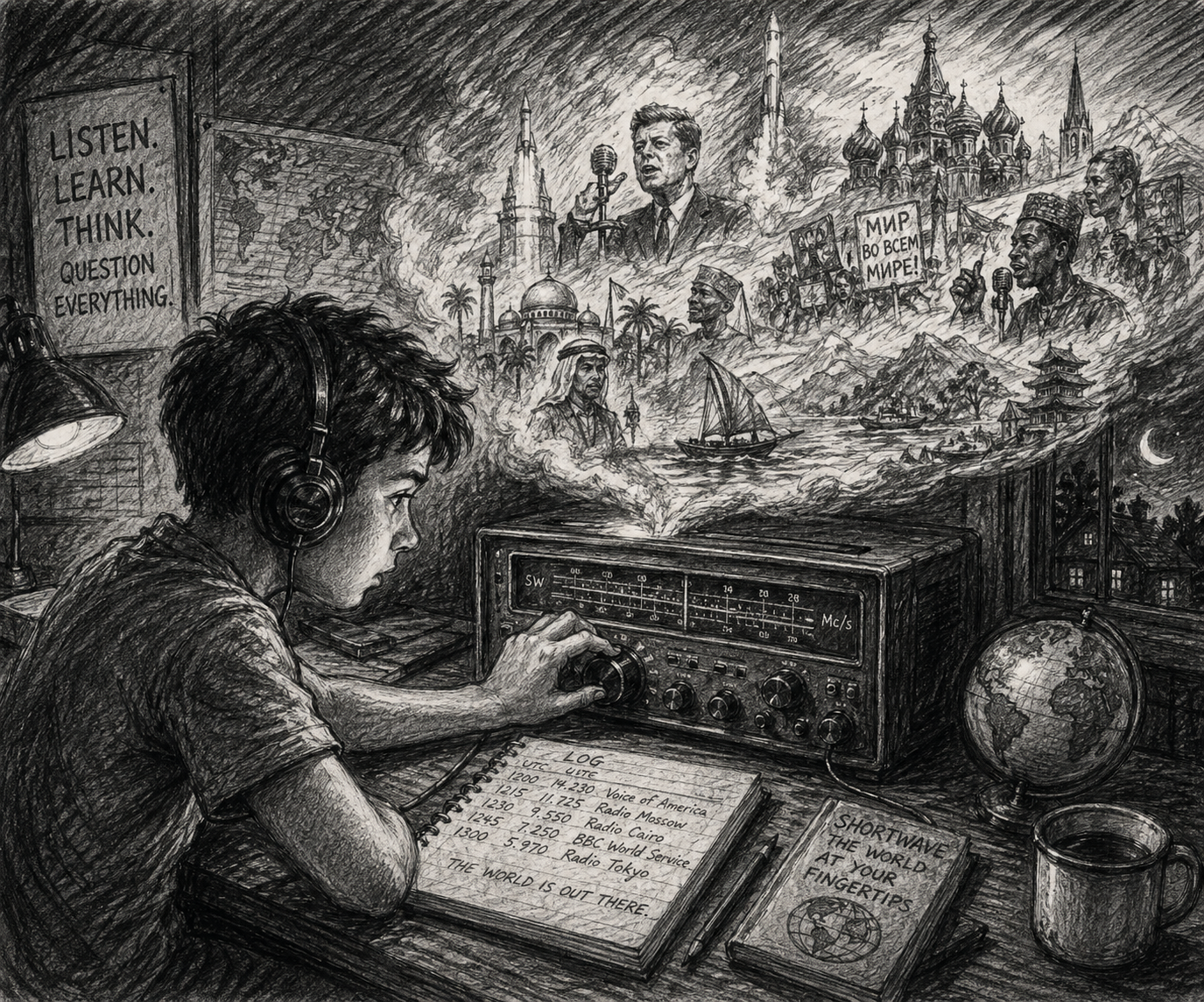
As a kid, before the internet, I spent late nights tuning my shortwave radio around in search of weak signals. Those far away radio stations helped me to imagine far away parts of the world. I’m still an amateur radio operator (I know it’s a nerd badge, but if you read my blogs, this likely doesn’t put you off too much). Years of tracking signals from foreign countries, ships at sea and satellites help me to feel connected to the world.
I’m a futurist by nature, so these days I also track a different type of signal — the signals of change. Especially in these times of dramatic shifts, I like having insights into how the world is changing. I’ve been doing this for years across several jobs, and this year I have been developing a daily practice of tracking weak signals, the early indicators that give us hints at possible futures. You can read about my process here. Recently, I’ve been tracking the early indicators of where AI, governance, energy, biotech, and the rest are heading — and feeding them into a small probability engine I created that scores six possible futures. The whole thing lives at yoroger.com/signals; the Signals tab is where you will find the daily reports, but the Evidence Explorer is where most of the data is illustrated for graphical exploration.
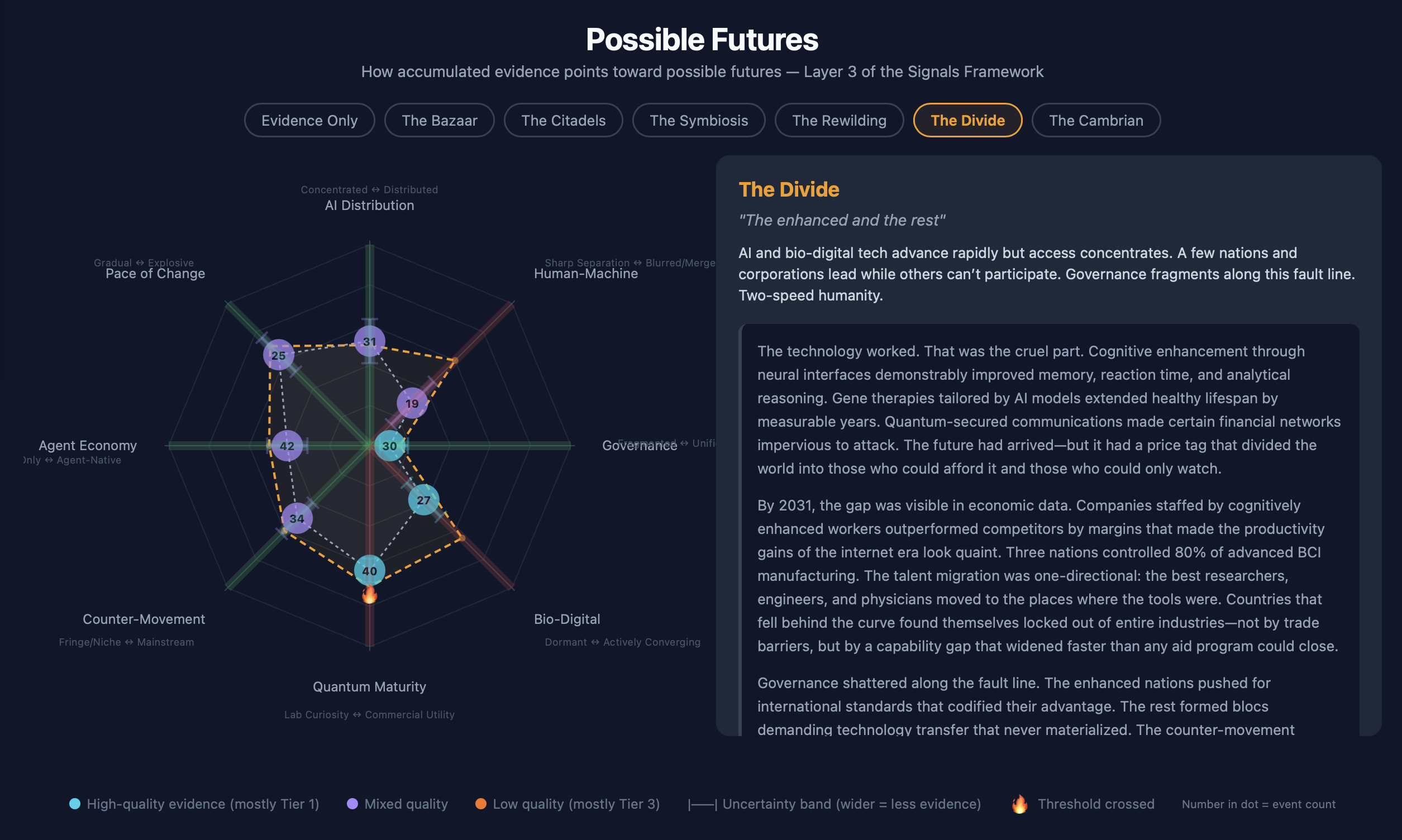
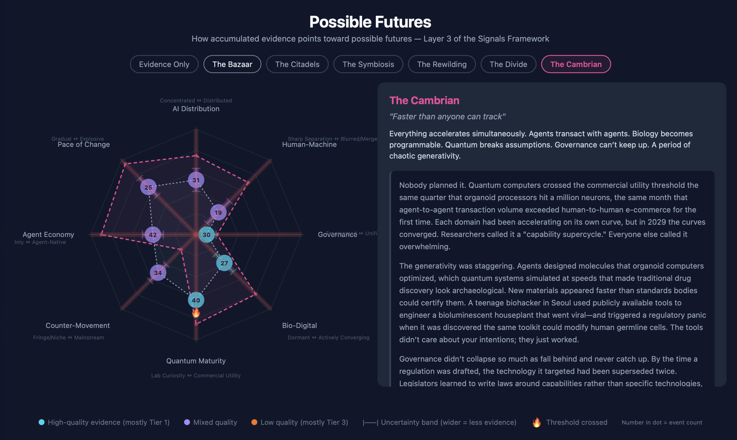
Earlier today I was looking at the dashboard and I noticed something. The scenario whose probability has risen fastest this week (“The Cambrian”) is the one whose 8-axis fingerprint least resembles the present. And the scenario whose fingerprint most resembles the present (“The Divide”) is sitting near the middle of the probability table.
That looks like a contradiction, but it isn’t. It turned out to be one of the more useful recent observations about my weak signals practice — and a small fix in the dashboard that came out of unpacking it. This post is the writeup.
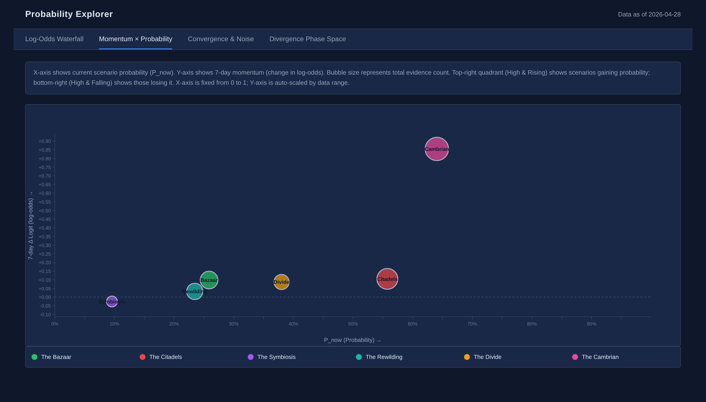 The Momentum × Probability view: Cambrian is the lone outlier in the upper right. Live: Momentum × Probability tab on yoroger.com.
First a little background. The six scenarios I’m tracking are NOT mutually exclusive, nor do they represent all the possible futures we could be headed toward. Instead they are a set of potential futures that I happened to be interested in back in January, so I started tracking them. My practice includes a daily scan for interesting articles, papers, projects, etc., always preferring primary sources. These daily collections use ChatGPT, Gemini, Perplexity, Grok and of course Claude-based agents and are evaluated as bottom-up possible indicators of change. With further analysis including purposeful searches for contradicting data, I look directionally for where these signals point and identify the things that are holding back that potential future. Then, going forward, I look for those “tracking signals” that would tell me if there is a breakthrough or setback that makes a particular potential future more or less probable. I can go on for hours about this, so I’ll spare you for now.
The interesting question is: how did we get to this place where I see potentially contradictory information? Here’s a Rosling-style animated bubble chart showing the probabilities evolving over the last six weeks. Along the Y axis is the amount of change and the X axis shows the estimated probability of the future scenario. Press play and watch Cambrian’s pink bubble climb the right edge starting around April 14:
Animation: 58 daily frames from Feb 14 → Apr 28, smoothly interpolated via requestAnimationFrame so motion is continuous between data points. Each bubble is a scenario; trail dots show the last seven days of position. Direct: momentum_probability_animation.html.
If your viewer doesn’t run JavaScript, here are three frames that capture the arc — Feb 14 (the calm equilibrium), Apr 18 (Cambrian climbing the upper-left quadrant on accumulated quantum + agentic-AI evidence), and Apr 28 (the current state, Cambrian alone in the upper-right):
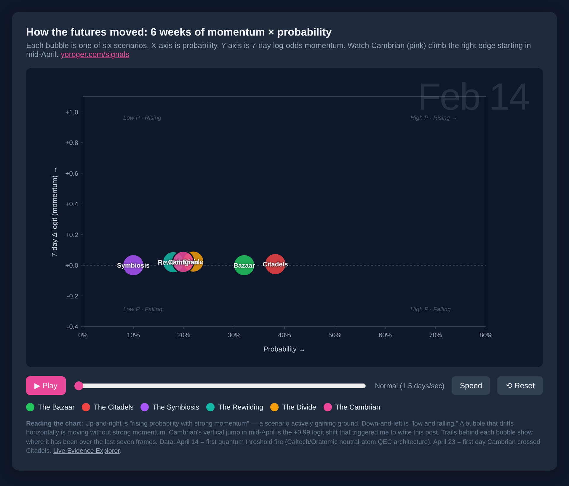 Feb 14 — equilibrium.
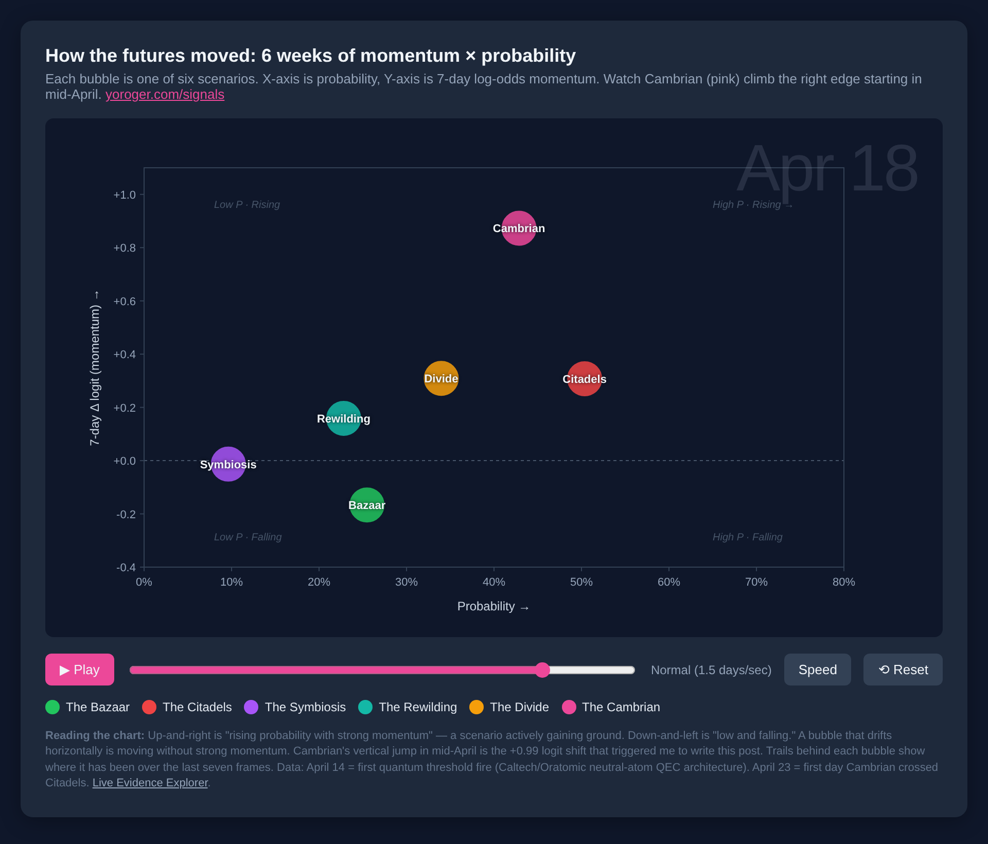 Apr 18 — Cambrian climbing fast on the y-axis (momentum) before its probability has caught up.
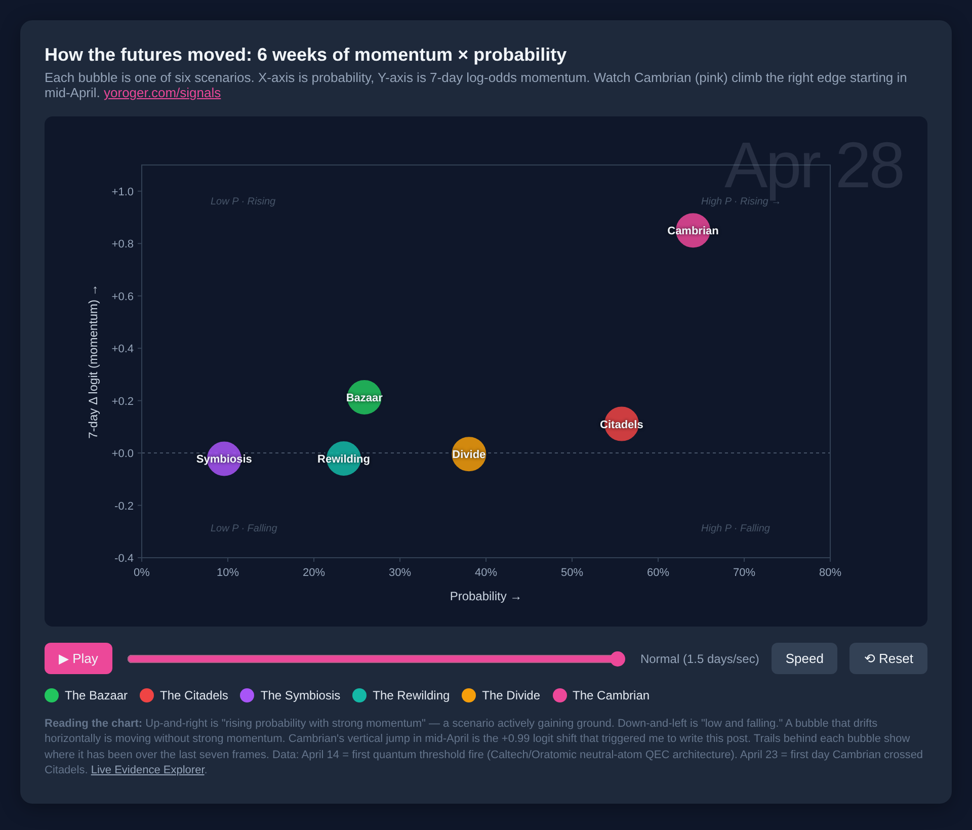 Apr 28 — Cambrian has crossed into the upper-right and pulled away.
The animation tells a story the static frame can’t. For most of February and March, the six bubbles drift around the lower half of the plot — small probability moves, momentum jittering near zero, no clear signal. Then around April 12, Divide’s amber bubble starts climbing on a string of governance and energy-policy signals. April 14, Cambrian’s pink bubble starts climbing — and unlike Divide, it doesn’t slow down. By April 23, Cambrian has crossed Citadels (the prior “most likely” scenario, +0.99 logit on April 19) and started pulling away. The chart is showing what a phase transition in the evidence looks like.
The setup, briefly
The dashboard has two pieces that matter for this story.
Eight axes: simple sliders the practice tracks against accumulated evidence — AI Distribution (concentrated → distributed), Human-Machine boundary (sharp → blurred), Governance (fragmented → unified), Bio-Digital convergence, Quantum Maturity, Counter-Movement (fringe → mainstream), Agent Economy, and Pace of Change. Each axis has a position and an uncertainty band, re-evaluated weekly against everything that’s accumulated.
Six scenarios: archetypes — The Bazaar (distributed everything, individuals empowered), The Citadels (a few walled gardens own AI), The Symbiosis (humans and machines fuse, governance keeps up), The Rewilding (significant cultural retreat from AI), The Divide (haves and have-nots in a slow patchwork), and The Cambrian (everything accelerates simultaneously, governance can’t keep up). Each scenario carries an expected position on each of the 8 axes — its archetypal “fingerprint.”
A probability engine takes evidence records — daily-report signals tagged with type (confirming/disconfirming/complicating), tier, and implication strength — and feeds them through a signal-to-scenario weight map. Each scenario gets an updated probability that doesn’t sum to 1 across scenarios (they’re not mutually exclusive in the strict sense — they overlap and one scenario’s evidence can lift another. This is because, for example, the Citadels — a few companies control AI — could be true while a Cambrian explosion of other activity happens across other domains).
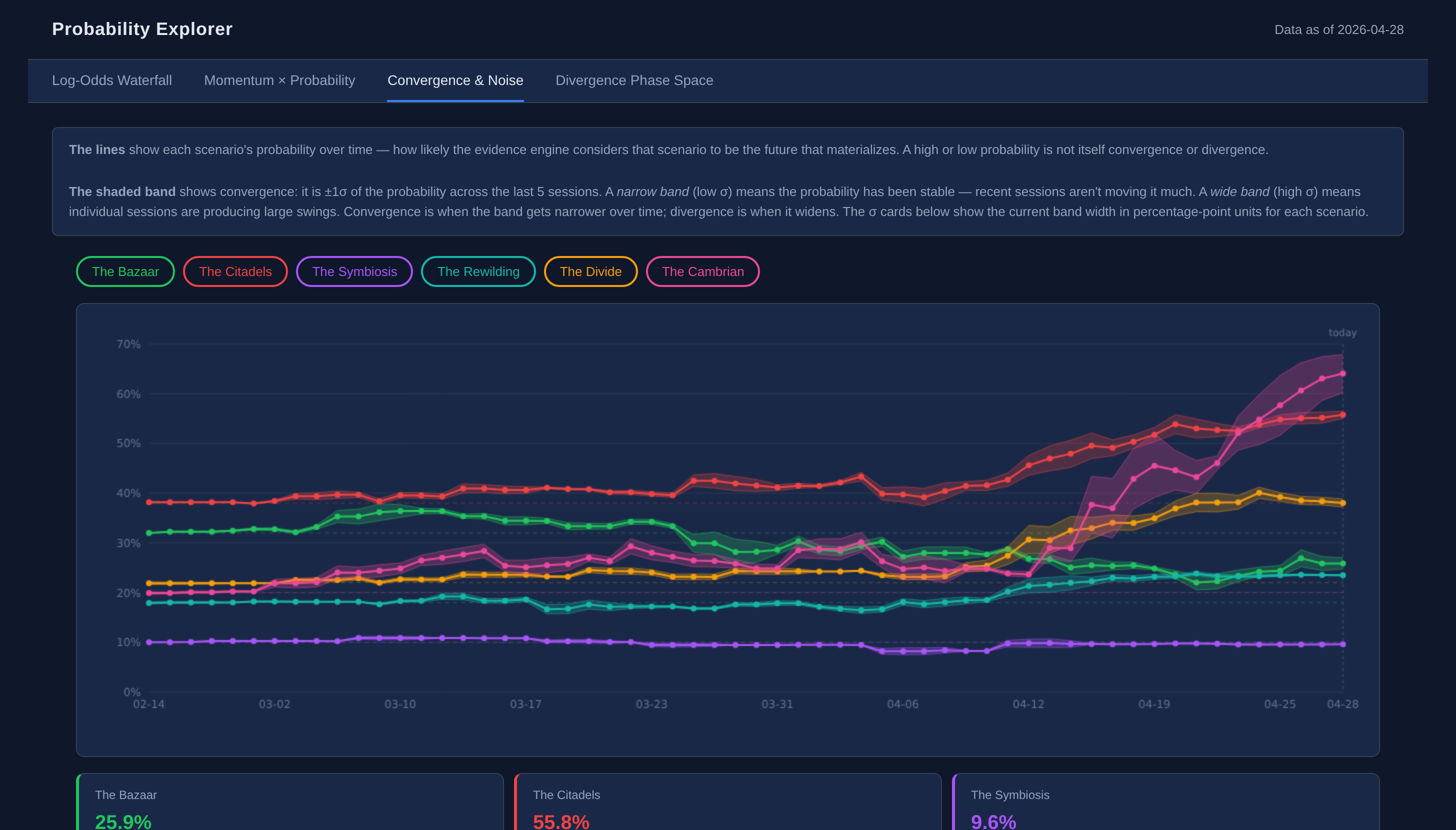 Probabilities over time. Cambrian’s pink line is the one rocketing up at the right edge. Live: Convergence & Noise tab on yoroger.com.
So: axes summarize where the world looks like it is. Probabilities summarize where the evidence is pushing. Until today I’d been treating these as two sides of the same coin. They’re not.
The numbers that prompted this
Here’s the table from this morning (April 28, 2026):
| Scenario | Axes align | Beyond expected | In tension | Probability | Δ this week |
|---|---|---|---|---|---|
| The Divide | 5 | 0 | 3 | 38.0% | +2.0 pp |
| The Bazaar | 4 | 0 | 4 | 25.9% | +1.8 pp |
| The Symbiosis | 2 | 0 | 6 | 9.6% | -0.2 pp |
| The Rewilding | 2 | 0 | 6 | 23.5% | +0.6 pp |
| The Citadels | 1 | 1 | 6 | 55.8% | +2.6 pp |
| The Cambrian | 0 | 1 | 7 | 64.1% | +20.9 pp |
Two scenarios at the extremes. The Divide is the world’s closest static fit — five of the eight axes are inside its expected band. The Cambrian is the world’s furthest static fit — zero of the eight axes are inside its band, seven are in tension. But Cambrian’s probability has jumped 21 percentage points in seven days, and it’s now the highest-probability scenario.
How is that possible? It’s possible because the two metrics are answering different questions.
Static fit vs. directional momentum
The axis-alignment metric is asking: Does today’s world look like this scenario’s archetype? It’s a snapshot. It compares the current axis position to the scenario’s expected value and either checks the box or doesn’t.
The probability engine is asking: Where is the evidence pushing the world? It’s looking at signal-level evidence — a quantum threshold fired, an agent commerce experiment got published, a benchmark integrity paper landed, a federal AI bill was introduced — and asking how each piece of evidence shifts the relative likelihood of each scenario, given the structural role that signal plays in each one.
Here’s the easy way to feel the difference. Imagine you’re standing in a parking lot in October, wearing shorts and a t-shirt because the temperature is 70°F. The static-fit reading says “summer.” The directional reading — leaves changing, wind shift, sun setting at 6:30 instead of 8:30 — says “winter is coming.” Both readings are correct. They’re describing the same lot at the same moment from different angles, and you need both to know whether to go inside and dig out a coat.
That’s what’s happening with The Divide and The Cambrian. The static fit says we’re in a Divide-shaped present: moderate AI distribution, fragmented governance, fast pace, moderate counter-movement, mixed agent economy. The directional reading says the wind has shifted: a quantum-fault-tolerance demonstration in mid-April, four arXiv preprints this week formalizing what governance lag looks like, an agent-on-agent commerce experiment from Anthropic, federal AI legislation consolidating into a single bill. None of that has yet moved the high-level axes — those move slowly, conservatively, weekly. But the signal-level cascade is registering on the probability engine in real time.
Why The Divide fits the present
Looking at the per-axis breakdown clarifies what kind of world we’re actually living in:
- AI Distribution at 0.52 (slider midpoint): The Divide expects 0.50 — middling concentration, neither fully captured by hyperscalers nor fully democratized. ✓
- Human-Machine boundary at 0.30 (sharp): The Divide expects 0.60 (somewhat blurred). The world is more separation-y than Divide expects — we still treat AI as a tool, not a partner. ✗
- Governance at 0.10 (fragmented): The Divide expects 0.15. ✓
- Bio-Digital at 0.38 (mostly dormant): The Divide expects 0.65. The world is less converging than Divide imagined. ✗
- Quantum Maturity at 0.62 (commercial-trending): The Divide expects 0.70. ✗
- Counter-Movement at 0.51 (mixed): The Divide expects 0.60. ✓
- Agent Economy at 0.41 (early): The Divide expects 0.50. ✓
- Pace of Change at 0.64 (fast): The Divide expects 0.70. ✓
Five aligns, three tensions. The tensions are revealing: we’re slower on bio-digital convergence and more separation-conscious about humans-vs-machines than The Divide’s archetype assumes. But on governance, distribution, agent economy, counter-movement, and pace, the world reads The-Divide-shaped. A patchwork — fragmented rules, fast pace, mid-distribution AI, modest pushback movements — with haves and have-nots increasingly visible inside the same patchwork.
That’s not a comfortable diagnosis. The Divide implies AI’s benefits accrue unevenly — to those with the resources to use it, learn it, deploy it; not to those who don’t. It implies the gap doesn’t get fixed by an inflection that solves it for everyone, but instead persists as a slow structural feature.
It’s also pretty close to what most readers would describe as “right now.”
Why The Cambrian dominates the probability
The Cambrian scenario expects everything pushed to the extremes: AI Distribution at 0.75, Human-Machine boundary at 0.70 (blurred), Governance at 0.20 (fragmented), Bio-Digital at 0.80, Quantum at 0.85, Counter-Movement at 0.20 (fringe), Agent Economy at 0.90, Pace at 0.95 (explosive). Compare those to the actual current axis positions and you get seven of eight in tension. The current world is nowhere near that.
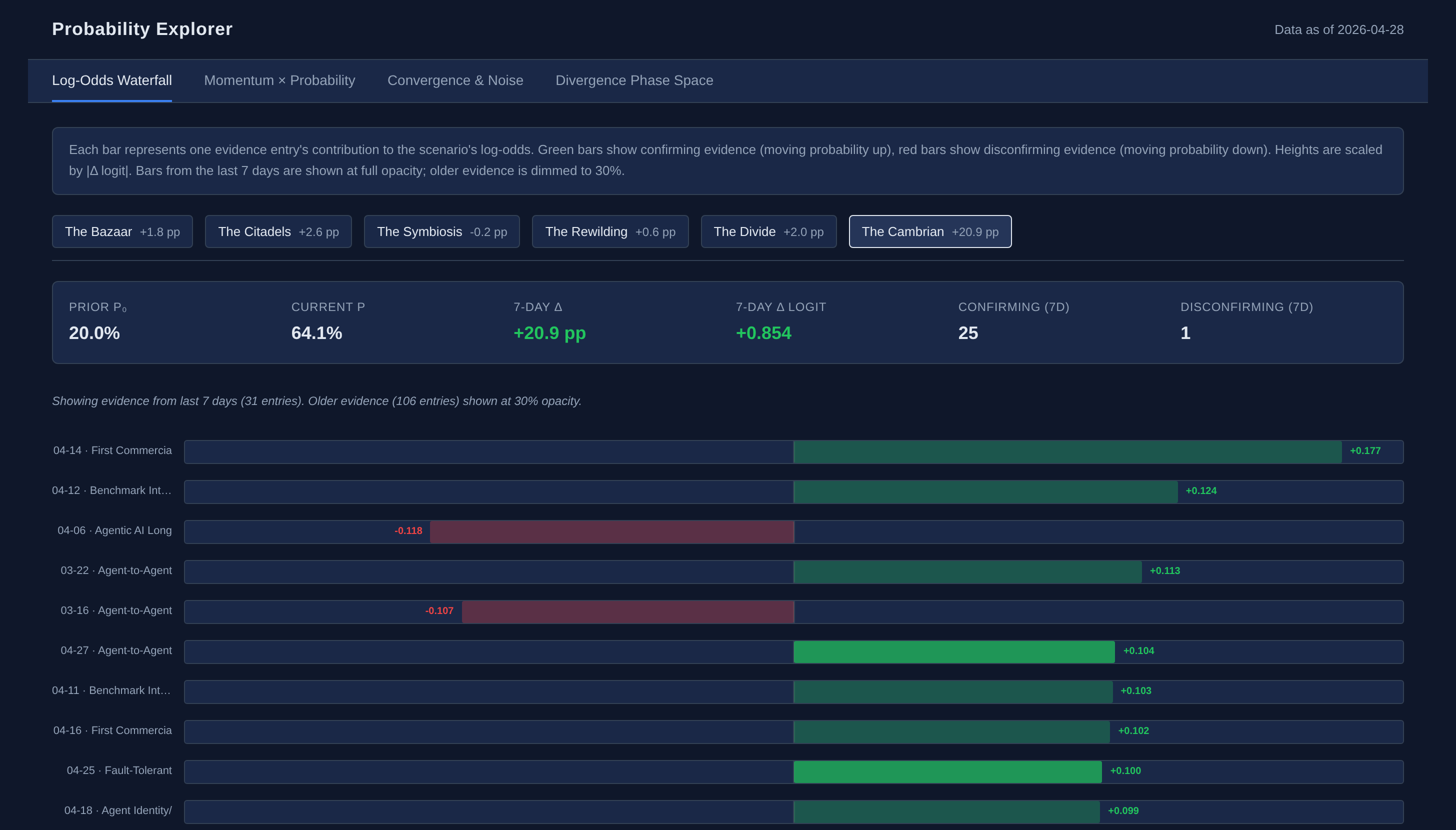 Cambrian’s Log-Odds Waterfall. 25 confirming entries vs. 1 disconfirming inside seven days — that’s the +20.9pp jump. Live: Log-Odds Waterfall tab on yoroger.com.
So why does the probability engine give Cambrian a 64.1% reading?
Because the recent signal-level evidence is doing exactly what Cambrian would predict. A quantum signal threshold fired in mid-April. The agentic AI signals are accumulating: agent commerce experiments, multi-agent infrastructure becoming product categories, benchmarks shifting from synthetic tests to operational telemetry. Four arXiv preprints in a single week argued formal frameworks for AI as core infrastructure, governance lag as the dominant risk vector, and the foundations of agentic world-modeling. Bill introductions and regulatory walkbacks are showing institutions struggling to keep pace. Each of those signals fires through the signal-to-scenario map with weights that say Cambrian is the scenario where this kind of evidence accumulates fastest.
The probability engine is, in effect, watching the wind shift. It’s not saying we are in Cambrian — the axis snapshot would correct that immediately. It’s saying that if recent rates continue, the axes will catch up over weeks or months, and Cambrian becomes increasingly the directional bet.
The display bug that fell out of this
There’s a small methodological wrinkle worth telling because it explains something the dashboard was getting subtly wrong.
When I first noticed this divergence, the dashboard’s per-axis alignment listing for Cambrian read “Evidence lower than expected” on every axis except Counter-Movement. That phrasing reads, to a human, as the world is weaker than this scenario needs — which would mean every axis is holding Cambrian back. But the alignment test was binary: either the scenario’s expected position fell inside the current axis’s band, or it didn’t. There was no concept of “the world is more like this scenario than the scenario itself expects.”
That mattered for one axis: Governance. The Cambrian scenario expects governance at 0.20 (somewhat fragmented). The current axis sits at 0.10 (very fragmented). The world is more fragmented than even Cambrian’s archetype assumes. That’s directionally aligned with Cambrian, just past Cambrian’s expected fingerprint. But the binary band-test flagged it as “tension,” same as Counter-Movement (where the world is at 0.51 but Cambrian wants 0.20 — a genuine mismatch in the opposite direction).
I added a third state — call it “Beyond expected” — for axes where the world is past the scenario’s expected position in the scenario’s preferred direction. Now the Cambrian reading shows 0 align, 1 Beyond expected, 7 in tension — the same numerical takeaway as before, but with the one over-aligned axis surfaced rather than hidden. It’s a tiny UX fix, but it captured a meaningful distinction the previous display was collapsing.
The general lesson: when a single binary test treats two opposite kinds of difference identically, you lose information. The probability engine gets this right because it’s working with continuous signed contributions; the axis snapshot was getting it wrong because the comparison was a band-overlap test. Small thing, real consequence.
Reading the table well
If I were going to summarize the state of the world from this dashboard in a single sentence, it would be: We are in a Divide-shaped present with momentum carrying us toward either Citadels or Cambrian (or both).
A few specific things that fall out of that:
The Divide is the comfortable read. It looks like the world we’re in. It implies a known set of policy levers (redistribution, education access, regulatory design that addresses inequity directly). The Divide → Citadels drift is small in axis terms — Citadels expects similar values for governance fragmentation, agent economy, and pace, with the key difference being concentrated rather than distributed AI. So if Citadels wins the probability race over the next few months, the world will feel very similar to today, just with consolidation visible at the platform layer.
Cambrian is the uncomfortable read. It implies the recognizable structure of today doesn’t last — the axes don’t stay at their current values. The seven-axis tension between current state and Cambrian’s archetype is precisely the gap that would have to close. That gap closes through evidence-driven axis revaluation: each week, accumulated signals push axis positions, and the gap shrinks or doesn’t.
The probability for Cambrian rising 21pp in a week is the metric to watch. Not because Cambrian is the right scenario — it might not be — but because that velocity tells you the signal-level evidence is converging fast on a particular shape. Either the axes will catch up (in which case the static fit will start matching), or the velocity will dissipate (in which case Cambrian’s probability will fall back). Both outcomes are interesting; they’re just different.
What would change my mind
A few specific events that would invalidate the Cambrian-direction reading:
- Federal AI legislation passes with strong bipartisan governance scaffolding. That would push the Governance axis sharply toward unified, away from where Cambrian needs it.
- A major frontier-model release explicitly slows down for safety reasons — not just rhetoric, but a measurable capability cap or a tested suspension. That would push Pace away from Cambrian.
- A material counter-movement event — large-scale consumer AI rejection, a viral analog-resurgence trend with spending behind it, regulatory moratoria that hold rather than getting vetoed. That would push Counter-Movement past where the engine currently has it, and Counter-Movement is one of Cambrian’s incompatible signals.
Symmetrically, what would push Cambrian’s static fit closer to the present:
- Multiple signal threshold-fires in the same quarter (not just quantum — agent economy, bio-digital, edge AI). That would force axis revaluation upward.
- Governance staying fragmented despite federal consolidation attempts. The Lieu/Obernolte mega-bill is a test of this — if it gains traction, Governance moves toward unified; if it stalls, Governance stays fragmented and one of Cambrian’s tensions starts closing.
- Bio-Digital evidence catching up. There’s a structural story embedded in the current Bio-Digital position (0.38) that says we’re undertracking this category. Worth a deep dive.
Why I’m writing this
First of all, I’m excited to see interesting results coming out of this multi-month exercise beyond just a unique daily news feed. A very useful realization from running a foresight practice for the last several months has been that the same evidence reads two different ways depending on the question you ask. Static fit and directional momentum are both legitimate. They’re different views of the same world. They give different answers when the world is in transition — which, by definition, is exactly when you most need the model.
When the static fit and directional momentum agree, you have a stable scenario. When they disagree, you have a transition. And the gap between them — measured in axis tensions, evidence velocities, threshold proximities — is the transition itself.
So: are we in The Divide? Yes, structurally, today. Are we headed there permanently? The probability engine says no. The axes say “ask me next week.”
Both answers are correct. They’re just answering different questions.
Now if this can just tell me about stocks to invest in…
If you want to poke at the dashboard, it lives at yoroger.com/signals. The methodology is open and the data files are in the public repo. If something I’ve described above looks wrong, I’d love to hear about it — that’s exactly the kind of feedback the practice exists to incorporate.
Comments